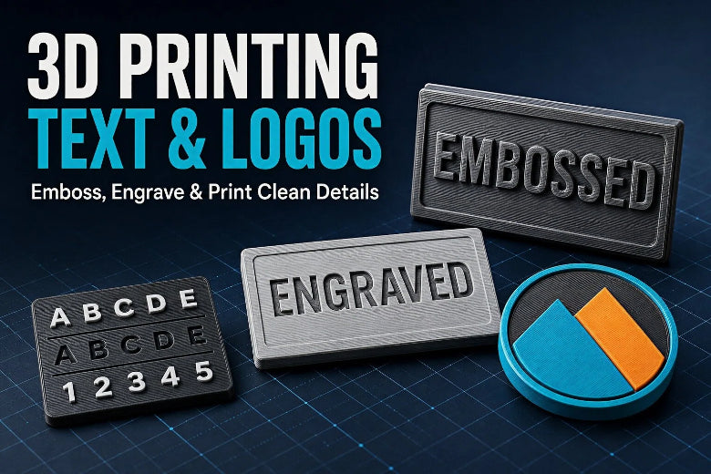
FDM builds parts from stacked layers of melted plastic squeezed through a round nozzle. Every detail has a minimum size it can hold, and that's especially unforgiving on thin letter strokes, tight enclosed spaces, and anything on a vertical face where layer texture does the talking. The good news: the fixes are mostly design and slicing choices you make before the first layer goes down. Here's how to get crisp 3D printing text and logos on your own machine.
Embossed vs Engraved 3D Printing: Which Works Better?
Before you obsess over sizes, decide how the text sits on the part. You have three options, and each prints differently.
|
Detail |
Embossed (raised) |
Engraved (recessed) |
Cut-through |
|---|---|---|---|
|
How it reads |
Catches light and shadow, easy to see at a glance |
Clean, flush look; needs enough depth to be visible |
Fully open hole through the part |
|
Print reliability |
Thin raised strokes can be fragile |
Recesses are protected and forgiving |
Needs suitable top wall so it doesn't collapse |
|
Typical starting point |
Height and stroke thick enough to span several layers |
Enough depth to read, usually thicker strokes |
Make the opening wide enough for your nozzle and verify it with a test print |
|
Best for |
Signs, labels, logos seen from a distance |
Functional parts, serial numbers, low-profile branding |
Lit signage, grilles |
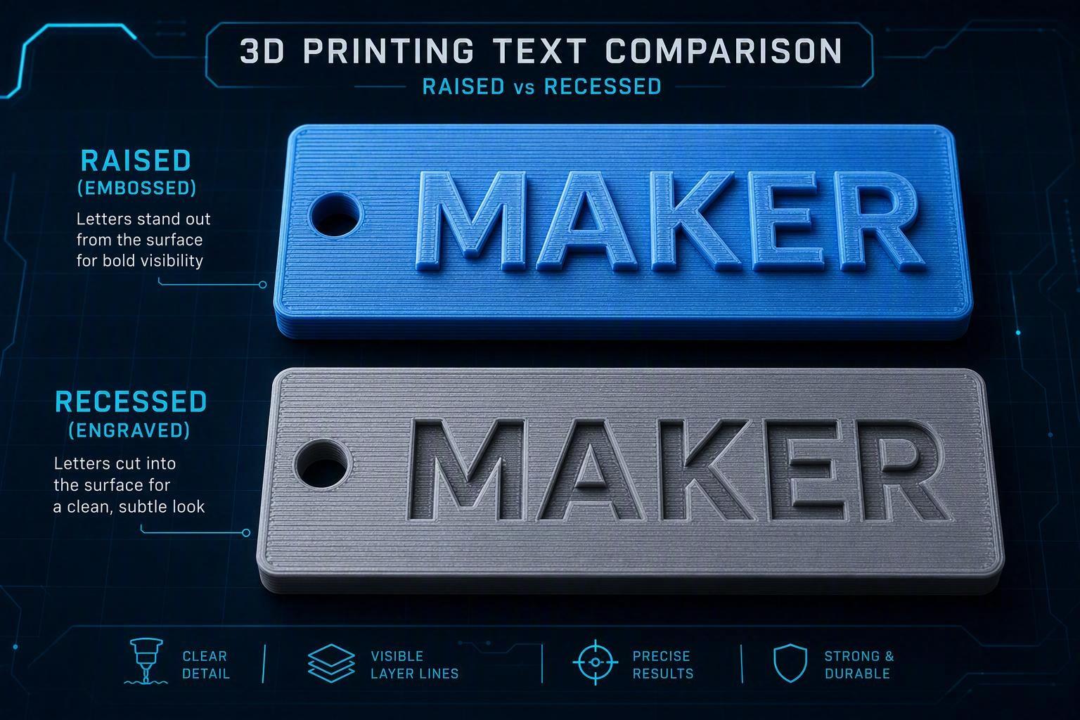
In plain terms, embossed text is usually easier to read because raised edges create shadow, but too-thin strokes break or wobble. Engraved text is more robust and sits flush, yet it fails the other way — if the recess is too shallow, it fills in and disappears. Cut-through is great when you really want a hole, like a backlit sign.
There's no universal winner. The Xometry guide notes raised text needs enough thickness and height to register, while recessed text needs enough depth to stay open. Match the method to the part.
The Best Fonts for 3D Printing
Font choice often matters more than any single slicer setting. A thin, delicate serif that looks crisp on screen usually prints as a smear because its hairline strokes are smaller than what the nozzle can lay down.
Beyond a bold, sans-serif font, focus on three traits:
- Stroke thickness. The narrowest part of any letter should be at least as wide as your nozzle — ideally more. With a common 0.4 mm nozzle, printing strokes under about half a millimeter is asking for trouble. As a process- and material-specific reference, some industrial FDM guidelines recommend around 1 mm for engraved details and 2.5 mm for raised details. Desktop printers may require different values, so test your design first.
- Spacing. Let letters breathe. When tight letter-spacing closes the counter (the enclosed space inside an "o" or "e"), plastic can fuse it shut. Open the tracking or add a little space between characters.
- Rounded corners. Sharp corners and tiny serifs are where layer lines pile up and round off. Simple, geometric letterforms with clean joints survive printing far better than ornate ones.
Arial, Helvetica, Montserrat, and similar plain geometric sans-serifs are reliable starting points when you're learning which fonts work best for 3D printing on your machine.
How to Print Text on a 3D Printer: Design by Surface
Where text sits changes how you design it, because the printer builds surfaces differently.
On a flat top or bottom face (the XY plane), text has the best shot at coming out clean. Raised text stacks full layers; engraved text reveals the recess as the nozzle tops it off. Use this orientation whenever the part allows.
On a curved surface, like the side of a mug, use a wrap or emboss tool rather than a flat sketch poked into the part, and expect letters on the steepest part of the curve to stretch slightly.
On a vertical wall, you're fighting a fundamental limit: each letter builds from the side, so every layer boundary shows as a stacked edge that looks ragged and "squished." Text on vertical faces may show more visible layer texture, but the result depends on orientation, font, and viewing direction.
Printer Settings That Decide Text Clarity
You can design perfectly and still get mushy letters if your slicing settings fight you. These are the levers that matter.
- Layer height. Fine text benefits hugely from thinner layers. Printing detail at 0.08–0.12 mm rather than 0.2 mm lets each letter's edge resolve with finer steps — the tradeoff is speed.
- Nozzle diameter. Sets the floor for feature size. A 0.4 mm nozzle suits most text; a 0.25 mm nozzle holds more detail but prints slower and clogs more easily.
- Line width. Slicers let you run a slightly thinner extrusion width than the nozzle diameter, which can capture fine features.
- Arachne / adaptive line width. Many slicers use the Arachne engine to automatically adjust wall width so it hugs thin details and small text. Still check the preview before printing, since it can't guarantee every tiny feature will come out clean.
- Wall thickness. Engraved text needs real depth so its surrounding walls stay supported and don't collapse.
- Print orientation. Flat-on-the-bed text beats vertical text in clarity nearly every time.
- Print speed. Slowing the outer walls dramatically improves letter edges; dropping outer-wall speed toward 50% for the text section is a common move.
None of these are fixed laws — your nozzle, layer height, filament, and calibration all shift what works, so treat them as starting points to test.
Creating Text and Logos in CAD
In most CAD packages the workflow is similar: sketch the text, then push it out of the surface (emboss/raise) or cut it into the surface (engrave). Tools with an "emboss" or "wrap" feature, like Fusion 360, make wrapping text around curves much easier.
For 3D printed logos, you're usually importing a vector or image. A few rules apply:
- Simplify the artwork. Logos full of tiny gaps, fine lines, and shading won't survive FDM. Remove or thicken anything thinner than what you can print.
- Use solid, closed shapes. A logo needs watertight geometry. Trace it as clean filled paths, not a raster image, or the slicer shows ragged islands.
- Size depth to the surface. Cut a recess deep enough to clear the top layers, or extrude it high enough to read as more than a bump.
A useful habit: model letters or your logo as a separate body. That makes assigning a different color in the slicer trivial, and lets you test just the text before committing to the full part.
Multi-Color 3D Printed Text and Logos
Adding a second color makes text and logos far easier to read — a white letter on a navy plaque pops in a way single-color emboss rarely does. You have a few routes.
The most accessible is a manual filament change. Design the colored text to start on a known layer, add a "pause at height" or M600 filament-change command there, swap the filament, purge, and resume. Use a pause-at-height command or your firmware's supported filament-change function. If you're new to it, Sovol's intro to multi-color 3D printing covers the basics.
A cleaner, lower-waste route is separate parts or inlays. Model the letters as their own thin body, print it in the accent color, and glue it into a recess or design a press-fit or snap-fit connection. This avoids purge waste and keeps the color boundary razor-sharp.
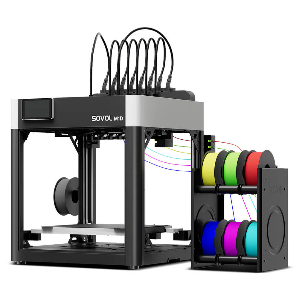
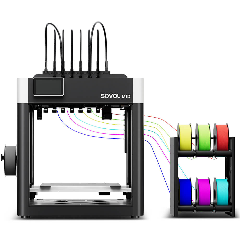
If you have a multi-material or multi-color machine (AMS, MMU, or dual/IDEX toolhead), assign base and text to different filaments and export as a 3MF file so colors survive, if supported by your slicer. The Sovol guide on cutting multi-color filament waste has practical fixes if purge waste adds up.
Common Problems and How to Fix Them
- Text disappears. Letters are too small, shallow, or thin. Increase height or depth, thicken strokes, or lower the layer height so features span more layers.
- Letters fuse together. Spacing is too tight or the font too ornate. Open the tracking and choose a simpler, bolder font.
- Small details look blurry. That's layer texture plus thin strokes. Use thinner layers, slow the outer walls, and consider a finer nozzle.
- Recessed text fills with material. The engraving is too shallow and the top layer closed it over. Increase depth to clear the top layers, with enough surrounding walls for support.
- Logos look uneven on curved surfaces. Flat geometry poked into a curve distorts. Use a wrap/emboss tool so the logo follows the radius.
Test-Print Text Before the Real Model
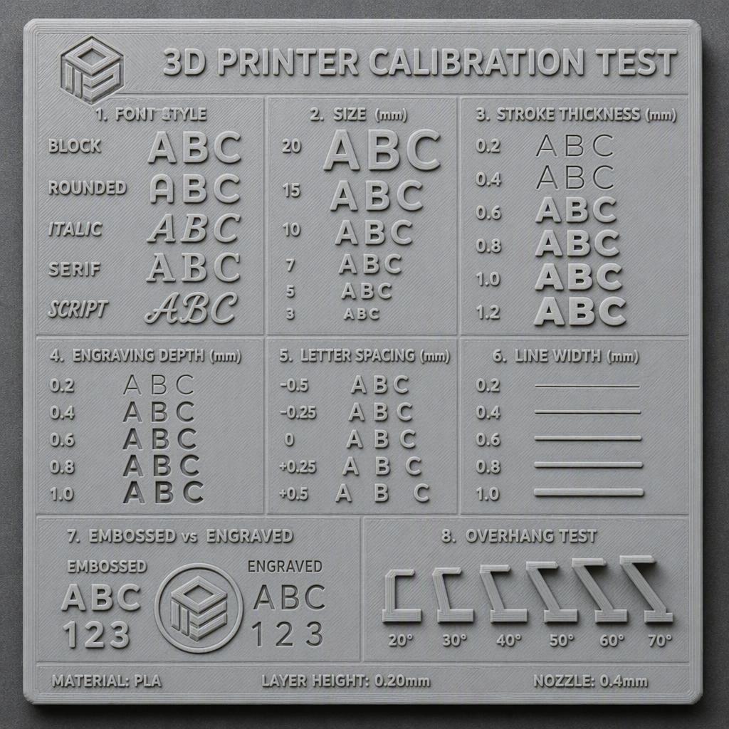
The fastest way to stop guessing is a small calibration plate with several variations at once, so you see what works on your printer before wasting filament on the real part.
- Make a thin square tile and place several copies of the same word or logo on it — each in a different size, stroke weight, or font.
- For raised text, test two or three heights; for engraved, test two or three depths. Label each so you can tell them apart.
- Include some tight-spaced text to see when letters start to fuse on your machine.
- Print at the layer height and outer-wall speed you'll use for the real part.
- Check readability at the distance you'll actually view the part from — not under a magnifier.
If the top surface looks rough around the text, ironing the top layer can smooth the ridges and let raised lettering sit on a cleaner surface.
Frequently Asked Questions
What's the smallest text a 3D printer can print? It depends on your nozzle, layer height, filament, and calibration. Keep every stroke at least as thick as your nozzle, keep character height well above that, and confirm with a test print — no universal number fits every machine.
Is raised or recessed text easier to read? Raised (embossed) text usually reads more easily because its edges catch light and shadow. Recessed text looks cleaner and more robust, but needs real depth or it disappears under the top layer.
Do I need a multi-color printer for colored text? No. A manual filament change with a "pause at height" command gives you two-color text on most FDM printers. Dedicated multi-color hardware just automates the swaps.
Why does text on the side of my part look bad? Vertical text is built from stacked layer edges, so it always looks more stepped than flat text. Make it bigger and thicker, or rotate the part so it prints flat.
Does a smaller nozzle always mean better text? Not automatically. A finer nozzle captures more detail but prints slower and clogs more easily. Match the nozzle to the smallest feature you actually need; a 0.4 mm nozzle handles most text fine.
Print Text That Looks as Good as You Designed It
Learning how to make text readable in 3D printing comes down to a few decisions made before you slice: choose a bold, simple font with thick strokes and real spacing; put the text where it prints best; pick raised, recessed, or cut-through deliberately; and set layer height, walls, and outer-wall speed to respect the detail. Then let a calibration plate tell you what your printer can actually hold.
There's no magic universal setting, and chasing one is the wrong rabbit hole. Test once, note the sizes and depths that work on your filament and nozzle, and clean readable details become a repeatable result instead of a lucky roll.